16 Factors
16.1 Introduction
因子用于处理分类变量(categorical variables),即那些具有固定且已知可能值集合的变量。 当你希望以非字母顺序显示字符向量时,它们同样非常有用。
我们将首先探讨数据分析为何需要因子1,以及如何使用factor()函数创建因子。 接着,我们将介绍包含一系列分类变量的gss_cat数据集供你实践。 之后,你将使用该数据集练习调整因子的顺序和数值,最后我们将讨论有序因子的相关概念。
16.1.1 Prerequisites
Base R 提供了一些用于创建和操作因子的基本工具。 我们将通过forcats包来增强这些功能,该包是核心 tidyverse 的一部分。 它提供了处理分类变量的工具(其名称是”factors”的变位词!),并包含多种辅助函数来操作因子。
16.2 Factor basics
假设您有一个记录月份的变量:
x1 <- c("Dec", "Apr", "Jan", "Mar")使用字符串来记录这个变量有两个问题:
-
只有十二个可能的月份,而且没有任何办法可以避免拼写错误:
x2 <- c("Dec", "Apr", "Jam", "Mar") -
它没有以有用的方式排序:
sort(x1)
#> [1] "Apr" "Dec" "Jan" "Mar"
您可以通过一个因子来解决这两个问题。 要创建因子,您必须首先创建有效级别(levels)的列表:
month_levels <- c(
  "Jan", "Feb", "Mar", "Apr", "May", "Jun",
  "Jul", "Aug", "Sep", "Oct", "Nov", "Dec"
)
现在您可以创建一个因子:
任何不在 level 中的值都将被默默地转换为 NA:
y2 <- factor(x2, levels = month_levels)
y2
#> [1] Dec  Apr  <NA> Mar
#> Levels: Jan Feb Mar Apr May Jun Jul Aug Sep Oct Nov Dec
这似乎有风险,因此您可能需要使用 forcats::fct() 代替:
y2 <- fct(x2, levels = month_levels)
#> Error in `fct()`:
#> ! All values of `x` must appear in `levels` or `na`
#> ℹ Missing level: "Jam"
如果省略 levels,它们将按字母顺序从数据中获取:
factor(x1)
#> [1] Dec Apr Jan Mar
#> Levels: Apr Dec Jan Mar
按字母顺序排序有一点风险,因为并非每台计算机都会以相同的方式对字符串进行排序。 因此 forcats::fct() 按首次出现排序:
fct(x1)
#> [1] Dec Apr Jan Mar
#> Levels: Dec Apr Jan Mar
如果您需要直接访问有效 levels 集,可以使用 levels() 来实现:
levels(y2)
#>  [1] "Jan" "Feb" "Mar" "Apr" "May" "Jun" "Jul" "Aug" "Sep" "Oct" "Nov" "Dec"
您还可以在使用 readr 和 col_factor() 读取数据时创建一个因子:
csv <- "
month,value
Jan,12
Feb,56
Mar,12"

df <- read_csv(csv, col_types = cols(month = col_factor(month_levels)))
#> Warning: The `file` argument of `read_csv()` should use `I()` for literal data as of
#> readr 2.2.0.
#>
#>   # Bad (for example):
#>   read_csv("x,y\n1,2")
#>
#>   # Good:
#>   read_csv(I("x,y\n1,2"))
df$month
#> [1] Jan Feb Mar
#> Levels: Jan Feb Mar Apr May Jun Jul Aug Sep Oct Nov Dec16.4 Modifying factor order
在可视化中更改因子水平的顺序通常很有用。 例如,假设你想探究不同宗教群体每天观看电视的平均小时数:
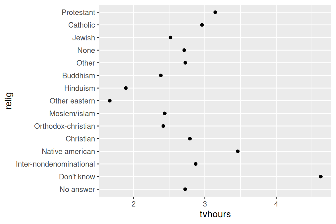
这张图表难以阅读,因为缺乏整体规律。 我们可以通过使用 fct_reorder() 重新排序 relig 的 levels 来改进它。 fct_reorder() 接受三个参数:
-
f, 需要修改 levels 的因子。 -
x, 用于重新排序 levels 的数值向量。 - 可选的,
fun, 当每个f的值对应多个x值时使用的函数,默认值为median。
ggplot(relig_summary, aes(x = tvhours, y = fct_reorder(relig, tvhours))) +
  geom_point()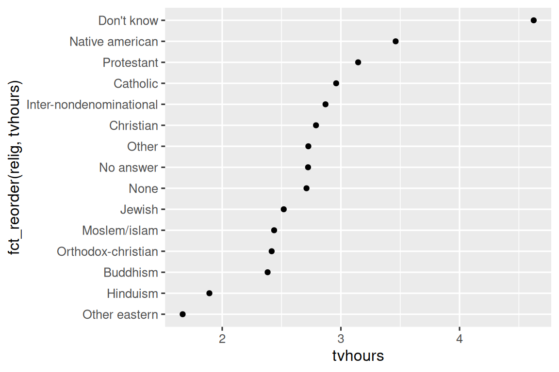
重新排序 religion 类别后,可以更清楚地看到 “Don’t know” 类别的人看电视的时间多得多,而 Hinduism & Other Eastern 看电视的时间则少得多。
当你开始进行更复杂的转换时,我们建议将其移出 aes(),并放入单独的 mutate() 步骤中。 例如,你可以将上面的图重写为:
relig_summary |>
  mutate(
    relig = fct_reorder(relig, tvhours)
  ) |>
  ggplot(aes(x = tvhours, y = relig)) +
  geom_point()
如果我们创建一个类似的图来观察平均年龄如何随报告的收入水平变化呢?
rincome_summary <- gss_cat |>
  group_by(rincome) |>
  summarize(
    age = mean(age, na.rm = TRUE),
    n = n()
  )

ggplot(rincome_summary, aes(x = age, y = fct_reorder(rincome, age))) +
  geom_point()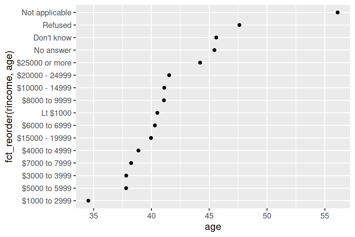
在这里,随意重新排序 levels 并不是一个好主意! 这是因为 rincome 已经有一个合理且不应打乱的固有顺序。 请将 fct_reorder() 保留用于那些 levels 是任意排序的因子。
然而,将 “Not applicable” 与其他特殊 levels 一起移到前面是有意义的。 你可以使用 fct_relevel()。 它接受一个因子, f, 以及任意数量你想要移到最前端的 levels。
ggplot(rincome_summary, aes(x = age, y = fct_relevel(rincome, "Not applicable"))) +
  geom_point()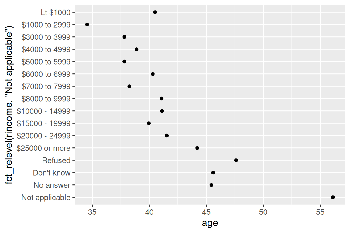
你认为 “Not applicable” 类别的平均年龄为何如此之高?
当你为图表中的线条着色时,另一种重新排序方式很有用。 fct_reorder2(f, x, y) 根据与最大 x 值相关联的 y 值来重新排序因子 f。 这使得图表更易阅读,因为图表最右侧的线条颜色将与图例对齐。
by_age <- gss_cat |>
filter(!is.na(age)) |>
count(age, marital) |>
group_by(age) |>
mutate(
prop = n / sum(n)
)
ggplot(by_age, aes(x = age, y = prop, color = marital)) +
geom_line(linewidth = 1) +
scale_color_brewer(palette = "Set1")
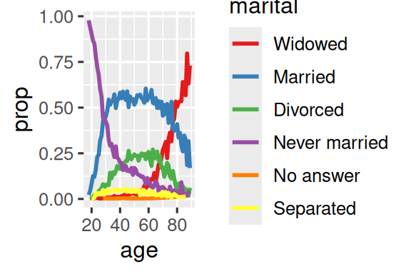
ggplot(by_age, aes(x = age, y = prop, color = fct_reorder2(marital, age, prop))) +
geom_line(linewidth = 1) +
scale_color_brewer(palette = "Set1") +
labs(color = "marital") 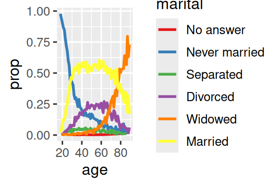 {fig-alt=’A line plot with age on the x-axis and proportion on the y-axis. There is one line for each category of marital status: no answer, never married, separated, divorced, widowed, and married. It is a little hard to read the plot because the order of the legend is unrelated to the lines on the plot.
Rearranging the legend makes the plot easier to read because the legend colors now match the order of the lines on the far right of the plot. You can see some unsurprising patterns: the proportion never married decreases with age, married forms an upside down U shape, and widowed starts off low but increases steeply after age 60.’ width=288}
 {fig-alt=’A line plot with age on the x-axis and proportion on the y-axis. There is one line for each category of marital status: no answer, never married, separated, divorced, widowed, and married. It is a little hard to read the plot because the order of the legend is unrelated to the lines on the plot.
Rearranging the legend makes the plot easier to read because the legend colors now match the order of the lines on the far right of the plot. You can see some unsurprising patterns: the proportion never married decreases with age, married forms an upside down U shape, and widowed starts off low but increases steeply after age 60.’ width=288}
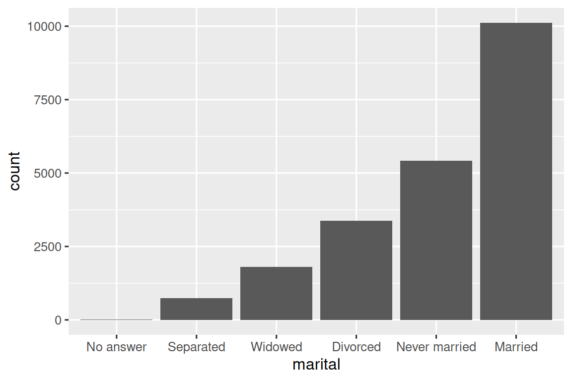
最后,对于条形图,你可以使用 fct_infreq() 按频率降序排列水平:这是最简单的重新排序类型,因为它不需要任何额外变量。 如果你想按频率升序排列,以便条形图中最大值在右侧而非左侧,可以将其与 fct_rev() 结合使用。
16.4.1 Exercises
tvhours中存在一些异常高的数值。 平均值是一个好的概括指标吗?对于
gss_cat中的每个因子,判断其 levels 的顺序是任意的还是有原则的。为什么将 “Not applicable” 移到 levels 的前端会使其在图中的位置移到底部?
16.5 Modifying factor levels
比改变 levels 顺序更强大的是改变它们的值。 这可以让你在发表时清晰标注,或在高层级展示中合并 levels。 最通用且强大的工具是 fct_recode()。 它允许你对每个 level 进行重新编码或更改其值。 例如,以 gss_cat 数据框中的 partyid 变量为例:
gss_cat |> count(partyid)
#> # A tibble: 10 × 2
#>   partyid                n
#>   <fct>              <int>
#> 1 No answer            154
#> 2 Don't know             1
#> 3 Other party          393
#> 4 Strong republican   2314
#> 5 Not str republican  3032
#> 6 Ind,near rep        1791
#> # ℹ 4 more rows
这些 levels 的表述简略且不一致。 让我们将其调整为更详细且结构统一的表达方式。 与 tidyverse 中大多数重命名和重新编码的函数类似,新值位于左侧,旧值位于右侧:
gss_cat |>
  mutate(
    partyid = fct_recode(partyid,
      "Republican, strong"    = "Strong republican",
      "Republican, weak"      = "Not str republican",
      "Independent, near rep" = "Ind,near rep",
      "Independent, near dem" = "Ind,near dem",
      "Democrat, weak"        = "Not str democrat",
      "Democrat, strong"      = "Strong democrat"
    )
  ) |>
  count(partyid)
#> # A tibble: 10 × 2
#>   partyid                   n
#>   <fct>                 <int>
#> 1 No answer               154
#> 2 Don't know                1
#> 3 Other party             393
#> 4 Republican, strong     2314
#> 5 Republican, weak       3032
#> 6 Independent, near rep  1791
#> # ℹ 4 more rows
fct_recode() 会保留未明确提及的原有 levels 不变,并在意外引用不存在的 level 时发出警告。
若要合并分组,可以将多个旧 levels 分配给同一个新 level:
gss_cat |>
  mutate(
    partyid = fct_recode(partyid,
      "Republican, strong"    = "Strong republican",
      "Republican, weak"      = "Not str republican",
      "Independent, near rep" = "Ind,near rep",
      "Independent, near dem" = "Ind,near dem",
      "Democrat, weak"        = "Not str democrat",
      "Democrat, strong"      = "Strong democrat",
      "Other"                 = "No answer",
      "Other"                 = "Don't know",
      "Other"                 = "Other party"
    )
  )
使用此技巧时需谨慎:如果将确实不同的类别合并,可能会导致结果产生误导。
如果你需要合并大量 levels,fct_collapse() 是 fct_recode() 的一个实用变体。 对于每个新变量,你可以提供一个包含旧 levels 的向量:
gss_cat |>
  mutate(
    partyid = fct_collapse(partyid,
      "other" = c("No answer", "Don't know", "Other party"),
      "rep" = c("Strong republican", "Not str republican"),
      "ind" = c("Ind,near rep", "Independent", "Ind,near dem"),
      "dem" = c("Not str democrat", "Strong democrat")
    )
  ) |>
  count(partyid)
#> # A tibble: 4 × 2
#>   partyid     n
#>   <fct>   <int>
#> 1 other     548
#> 2 rep      5346
#> 3 ind      8409
#> 4 dem      7180
有时,你只想将小组别合并以使图表或表格更简洁。 这正是 fct_lump_*() 系列函数的功能所在。 fct_lump_lowfreq() 是一个简单的起点,它会逐步将最小的组别类别合并为 “Other”,并始终将 “Other” 保持为最小的类别。
gss_cat |>
  mutate(relig = fct_lump_lowfreq(relig)) |>
  count(relig)
#> # A tibble: 2 × 2
#>   relig          n
#>   <fct>      <int>
#> 1 Protestant 10846
#> 2 Other      10637
但在此案例中,这种方法帮助不大:虽然调查中大多数美国人确实信奉新教,但我们可能希望看到更多细节! 相反,我们可以使用 fct_lump_n() 来明确指定恰好需要 10 个分组:
gss_cat |>
  mutate(relig = fct_lump_n(relig, n = 10)) |>
  count(relig, sort = TRUE)
#> # A tibble: 10 × 2
#>   relig          n
#>   <fct>      <int>
#> 1 Protestant 10846
#> 2 Catholic    5124
#> 3 None        3523
#> 4 Christian    689
#> 5 Other        458
#> 6 Jewish       388
#> # ℹ 4 more rows
请查阅文档以了解 fct_lump_min() 和 fct_lump_prop(),它们在其他情况下非常有用。
16.5.1 Exercises
自我认同为 Democrat、Republican 和 Independent 的比例随时间发生了怎样的变化?
如何将
rincome合并成少量类别?注意到上面的
fct_lump示例中有 9 个分组(不包括 other)。 为什么不是 10 个? (提示:输入?fct_lump,会发现参数other_level的默认值是 “Other”。)
16.6 Ordered factors
在我们继续之前,需要简要提及一种特殊的因子类型:有序因子。 有序因子通过 ordered() 创建,意味着各 levels 之间存在严格的顺序和等距关系:第一个 level 比第二个 level “小”的程度,与第二个 level 比第三个 level “小”的程度相同,依此类推。 打印时可以识别它们,因为它们在因子水平之间使用 < 符号:
实际上,ordered() 因子的行为与常规因子非常相似。 只有在两个地方你可能会注意到不同的行为:
- 如果在 ggplot2 中将有序因子映射到颜色或填充,它将默认使用
scale_color_viridis()/scale_fill_viridis(),这是一种暗示排序的颜色标度。 - 如果在线性模型中使用有序函数,它将使用“多边形对比”。这些对比略有用途,但除非你拥有统计学博士学位,否则可能从未听说过它们;即使有博士学位,你可能也不会常规地解释它们。如果你想了解更多,我们推荐 Lisa DeBruine 的
vignette("contrasts", package = "faux")。
鉴于这些差异的效用存在争议,我们通常不建议使用有序因子。
16.7 Summary
本章向你介绍了处理因子的实用工具——forcats包,并介绍了其中最常用的函数。 forcats 还包含许多其他辅助函数,因篇幅所限未能详述。因 此,当你遇到之前未接触过的因子分析挑战时,强烈建议浏览 reference index,查看是否有现成的函数能帮助你解决问题。
如果在阅读本章后希望进一步了解因子,推荐阅读 Amelia McNamara 和 Nicholas Horton 的论文 Wrangling categorical data in R。 该论文梳理了 stringsAsFactors: An unauthorized biography 和 stringsAsFactors = <sigh> 中讨论的部分历史背景,并将本书概述的分类数据整洁方法与 base R 方法进行了比较。 该论文的早期版本对 forcats 包的开发动机和范围界定起到了推动作用; 感谢 Amelia 和 Nick!
下一章我们将转向新的主题,开始学习 R 中的日期与时间处理。 日期和时间看似简单,但正如你将很快发现的,对它们了解得越多,就越能体会到其复杂性!
它们对建模也很重要。↩︎