11 Communication
11.1 Introduction
在 Chapter 10 中,您学会了如何使用绘图作为探索工具。 当您制作探索性绘图时,您甚至在查看之前就知道该图将显示的变量。 您是出于目的制作每个绘图,可以快速查看它,然后转到下一个绘图。 在大多数分析过程中,您会生产数十或数百个绘图,其中大多数立即被扔掉。
现在您了解了您的数据,您需要将您的理解传达给他人。 您的听众可能不会分享您的背景知识,也不会在数据上投入大量投资。 为了帮助他人迅速建立一个良好的心理模型,您将需要投入大量精力,以使图尽可能自我解释。 在本章中,您将学习 ggplot2 提供的用来做这些的工具。
本章重点介绍您创建良好图形所需的工具。 我们假设您知道您想要什么,只需要知道如何做。 因此,我们强烈建议将本章与一本良好的一般可视化书配对。 我们特别喜欢 Albert Cairo 的 The Truthful Art。 它不会教导创建可视化的机制,而是专注于创建有效图形所需的考虑。
11.1.1 Prerequisites
在本章中,我们将再次关注 ggplot2。 我们还将使用一些 dplyr 进行数据操作,scales 去覆盖默认 breaks,labels,transformations 和 palettes,以及一些 ggplot2 拓展包,包括 Kamil Slowikowski 的 ggrepel (https://ggrepel.slowkow.com),和 Thomas Lin Pedersen 的 patchwork (https://patchwork.data-imaginist.com)。 不要忘记,如果您还没有安装它们,则需要使用 install.packages() 安装这些软件包。
11.2 Labels
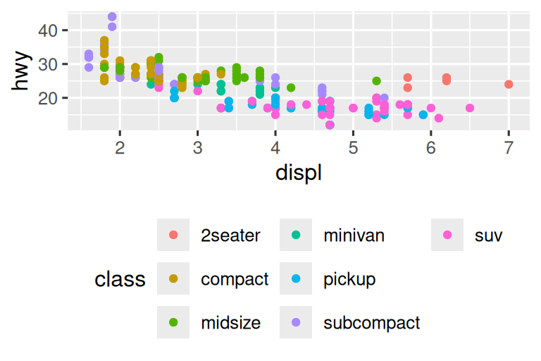
将探索性图形转换为说明性图形时,最简单的起点是具有良好的标签。 您使用labs() 函数添加标签(labels)。
ggplot(mpg, aes(x = displ, y = hwy)) +
  geom_point(aes(color = class)) +
  geom_smooth(se = FALSE) +
  labs(
    x = "Engine displacement (L)",
    y = "Highway fuel economy (mpg)",
    color = "Car type",
    title = "Fuel efficiency generally decreases with engine size",
    subtitle = "Two seaters (sports cars) are an exception because of their light weight",
    caption = "Data from fueleconomy.gov"
  )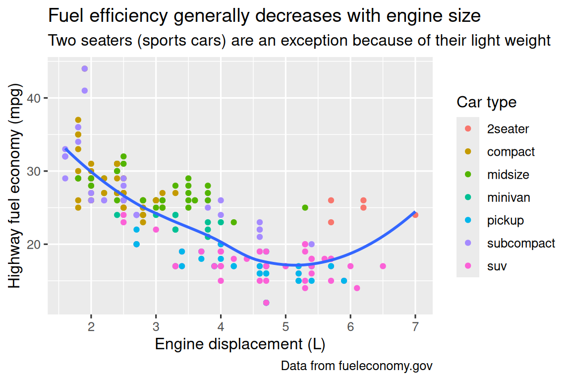
绘图标题(title)的目的是总结主要发现。 避免仅描述绘图的标题,例如 “A scatterplot of engine displacement vs. fuel economy”。
如果您需要添加更多文本,则还有其他两个有用的标签:subtitle 在标题下方用较小的字体添加了其他细节,caption 在图的右下方添加了文本,通常用于描述数据来源。 您还可以使用 labs() 替换 axis 和 legend titles。 通常,用更详细的描述替换简短名称并包括单位是一个好主意。
可以使用数学方程而不是文本字符串。 只需切换 "" 为 quote(),然后阅读 ?plotmath 中的可用选项:
11.2.1 Exercises
用自定义的
title,subtitle,caption,x,y和color标签在 fuel economy data 上创建一个绘图。-
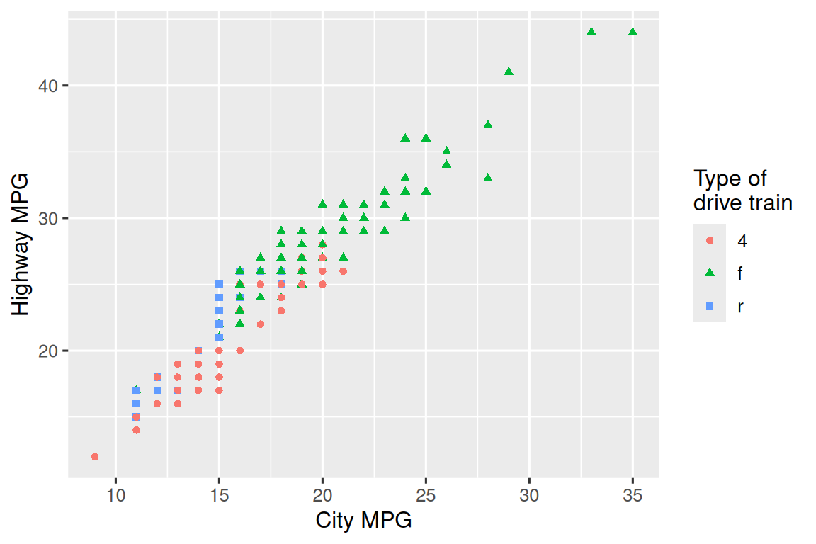
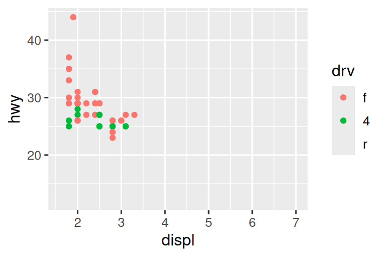
使用 fuel economy data 重新创建以下绘图。 请注意,点的颜色和形状因驱动列车类型而异。
探索您在上个月创建的图形,并添加内容丰富的标题,以使其他人更容易理解。
11.3 Annotations
除了标记图的主要组成部分外,它通常对标记单个观察结果或观察群也很有用。 您可以使用的第一个工具是 geom_text()。 geom_text() 类似于 geom_point(),但它具有额外的美学:label。 这使得它可以在图中添加文本标签。
标签有两种可能的来源。 首先,您可能有一个提供标签的 tibble 数据。 在以下图中,我们拔出了每种驱动器类型中发动机尺寸最高的汽车,并将其信息保存为一个名为 label_info 的新数据框。
label_info <- mpg |>
  group_by(drv) |>
  arrange(desc(displ)) |>
  slice_head(n = 1) |>
  mutate(
    drive_type = case_when(
      drv == "f" ~ "front-wheel drive",
      drv == "r" ~ "rear-wheel drive",
      drv == "4" ~ "4-wheel drive"
    )
  ) |>
  select(displ, hwy, drv, drive_type)

label_info
#> # A tibble: 3 × 4
#> # Groups:   drv [3]
#>   displ   hwy drv   drive_type
#>   <dbl> <int> <chr> <chr>
#> 1   6.5    17 4     4-wheel drive
#> 2   5.3    25 f     front-wheel drive
#> 3   7      24 r     rear-wheel drive
然后,我们使用此新数据框直接标记这三个组,以直接使用标签来替换图例。 使 fontface 和 size 参数,我们可以自定义文本标签的外观。 它们比绘图上的其余文本大。 (theme(legend.position = "none") 关闭所有图例 — 我们将很快谈论它.)
ggplot(mpg, aes(x = displ, y = hwy, color = drv)) +
  geom_point(alpha = 0.3) +
  geom_smooth(se = FALSE) +
  geom_text(
    data = label_info,
    aes(x = displ, y = hwy, label = drive_type),
    fontface = "bold", size = 5, hjust = "right", vjust = "bottom"
  ) +
  theme(legend.position = "none")
#> `geom_smooth()` using method = 'loess' and formula = 'y ~ x'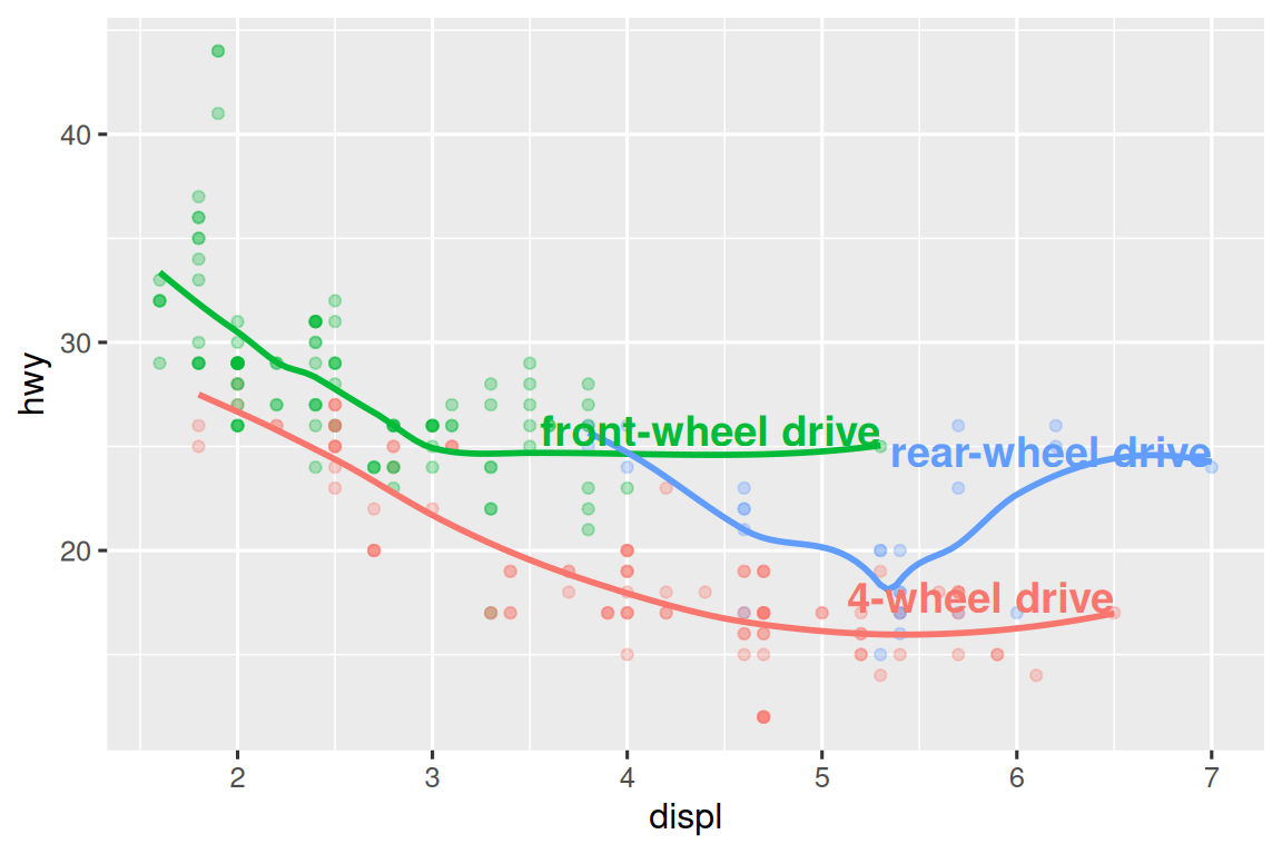
请注意,使用 hjust(水平对齐)和 vjust(垂直对齐)来控制标签的对齐。
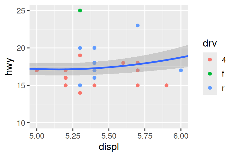
但是,我们上面制作的带注释的图很难阅读,因为标签彼此重叠,并且与点重叠。 我们可以使用 ggrepel 软件包中的 geom_label_repel() 函数来解决这两个问题。 这个有用的软件包将自动调整标签,以免重叠:
ggplot(mpg, aes(x = displ, y = hwy, color = drv)) +
  geom_point(alpha = 0.3) +
  geom_smooth(se = FALSE) +
  geom_label_repel(
    data = label_info,
    aes(x = displ, y = hwy, label = drive_type),
    fontface = "bold", size = 5, nudge_y = 2
  ) +
  theme(legend.position = "none")
#> `geom_smooth()` using method = 'loess' and formula = 'y ~ x'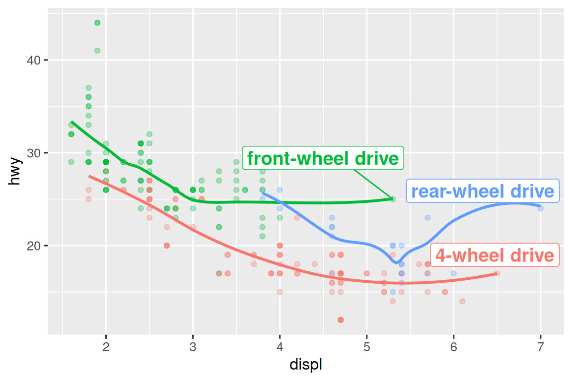
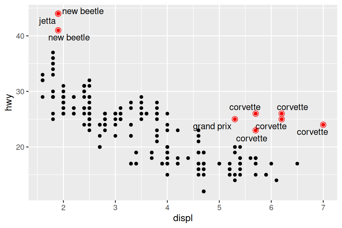
您也可以使用相同的想法使用 ggrepel 软件包中的 geom_text_repel() 突出显示图上的某些点。 请注意此处使用的另一种方便的技术:我们添加了第二层大的空心点,以进一步突出标记的点。
potential_outliers <- mpg |>
  filter(hwy > 40 | (hwy > 20 & displ > 5))

ggplot(mpg, aes(x = displ, y = hwy)) +
  geom_point() +
  geom_text_repel(data = potential_outliers, aes(label = model)) +
  geom_point(data = potential_outliers, color = "red") +
  geom_point(
    data = potential_outliers,
    color = "red", size = 3, shape = "circle open"
  )
请记住,除了 geom_text() 和 geom_label() 之外,您还可以在 ggplot2 中使用许多其他 geoms,以帮助您注释您的绘图。 一些想法:
使用
geom_hline()和geom_vline()添加参考线。 我们通常会使它们变厚(linewidth = 2)和变白色(color = white),然后将它们绘制在主要数据层下方。 这使得它们易于看到,而无需从数据中吸引注意力。使用
geom_rect()绘制围绕感兴趣点的矩形。 矩形的边界由美学xmin,xmax,ymin,ymax定义。 另外,请查看 ggforce package 软件包,特别是geom_mark_hull(),它允许您用 hulls 注释点子集。将
geom_segment()与arrow参数一起使用,将注意力吸引到用箭头的点上。 使用美学x和y来定义起始位置,然后xend和yend定义结束位置。
向图添加注释的另一个方便函数是 annotate()。 根据经验,geoms 通常对于突出数据子集很有用,而 annotate() 对于将一个或几个注释元素添加到图中很有用。
要演示使用 annotate(),让我们创建一些文本以添加到我们的图中。 文本有点长,因此我们将使用 stringr::str_wrap() 自动添加换行,给定您每行所需的字符数:
trend_text <- "Larger engine sizes tend to have lower fuel economy." |>
  str_wrap(width = 30)
trend_text
#> [1] "Larger engine sizes tend to\nhave lower fuel economy."
然后,我们添加两个注释层:一个带有 label geom,另一个带有 segment geom。 两者中的 x 和 y 美学都定义了注释应在哪里开始,并且 segment 注释中的 xend 和 yend 美学定义了该 segment 的最终位置。 还请注意,segment 使用箭头风格。
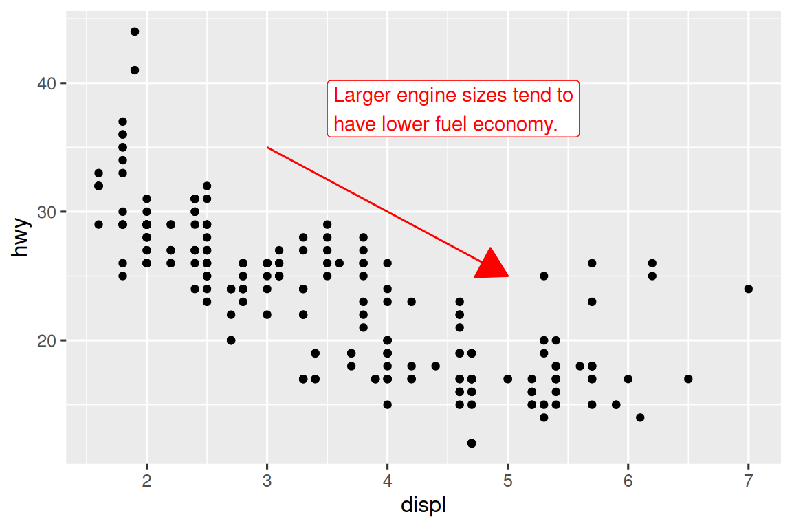
注释是传达您的可视化主要要点和有趣功能的强大工具。 唯一的限制是您的想象力(以及您对定位注释的耐心在美学上令人愉悦)!
11.3.1 Exercises
使用
geom_text()及 infinite positions 将文本放在图的四个角落。使用
annotate()在上一个图的中间添加 point geom,而无需创建 tibble。 自定义点的形状,大小或颜色。geom_text()的标签如何与 faceting 相互作用? 如何将标签添加到一个 facet? 您如何在每个 facet 放置不同的标签? (提示:考虑要传递给geom_text()的数据集。)geom_label()控制背景框外观的参数是什么?arrow()的四个参数是什么? 他们如何工作? 创建一系列展示最重要选项的图。
11.4 Scales
您可以使绘图更好地进行交流的第三种方法是调整 scales。 Scales 控制美学映射如何在视觉上表现出来。
11.4.1 Default scales
通常, ggplot2 自动为您添加 scales。 例如,当您输入时:
ggplot(mpg, aes(x = displ, y = hwy)) +
  geom_point(aes(color = class))
ggplot2 自动在场景后面添加默认 scales:
ggplot(mpg, aes(x = displ, y = hwy)) +
  geom_point(aes(color = class)) +
  scale_x_continuous() +
  scale_y_continuous() +
  scale_color_discrete()
请注意 scales 的命名方案:scale_ 然后是美学的名称,然后是 _,然后是 scale 的名称。 默认 scales 是根据与以下相符的变量类型命名的:continuous,discrete,datetime,date。 scale_x_continuous() 将来自 displ 的数值显示在 x 轴的连续数字线上,scale_color_discrete() 为每种汽车类选择颜色,等。 有很多非默认的 scales,您将在下面学习。
已经仔细选择了默认 scales,以便在各种输入中做得很好。 但是,您可能需要覆盖默认值,原因有两个:
您可能需要调整默认 scale 的某些参数。 这使您可以执行诸如更改轴上的 breaks 或图例上的关键标签之类的事情。
您可能需要完全替换 scale,并使用完全不同的算法。 通常,您可以做得比默认值更好,因为您对数据有更多了解。
11.4.2 Axis ticks and legend keys
轴(axes)和图例(legends)统称为 guides。 轴用于 x 和 y 美学;图例用于其他所有内容。
有两个主要参数会影响轴上 tick 的外观和图例中的 key:breaks 和 labels。 breaks 控制 ticks 的位置或与 keys 关联的值。 labels 控制与每个 tick/key 关联的文本标签。 breaks 的最常见用途是覆盖默认选择:
ggplot(mpg, aes(x = displ, y = hwy, color = drv)) +
  geom_point() +
scale_y_continuous(breaks = seq(15, 40, by = 5)) 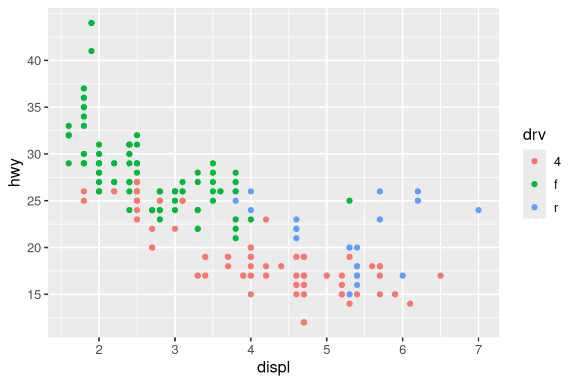
您可以以相同的方式使用 labels(一个特征向量与 breaks 相同的长度),但是您也可以将其设置为 NULL 以完全抑制标签。 这对于地图可能很有用,也可以发布您无法共享绝对数字的图。 您还可以使用 breaks 和 labels 来控制图例的外观。 对于分类变量的离散 scales,labels 可以是现有 levels 名称和所需标签的命名列表。
ggplot(mpg, aes(x = displ, y = hwy, color = drv)) +
  geom_point() +
  scale_x_continuous(labels = NULL) +
  scale_y_continuous(labels = NULL) +
  scale_color_discrete(labels = c("4" = "4-wheel", "f" = "front", "r" = "rear"))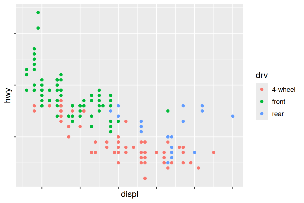
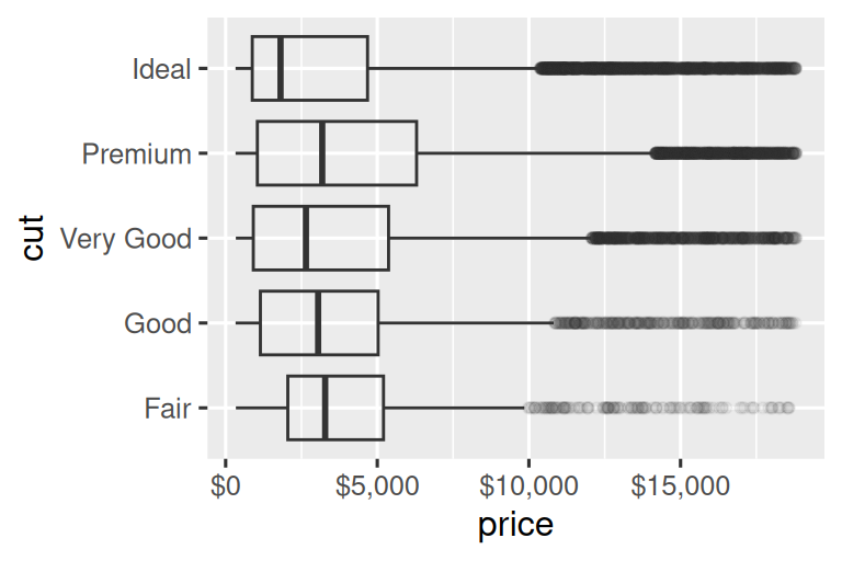
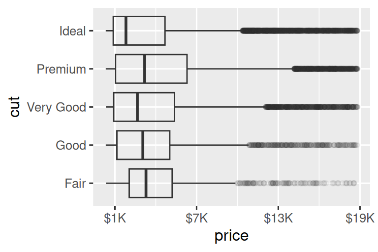
labels 参数以及来自 scales 软件包的标签函数也可用于格式化数字为货币,百分比等。 左侧的绘图显示了带有 label_dollar() 的默认标签,该标签添加了一个美元符号以及一个千分位逗号。 右侧的绘图进一步添加了自定义,通过将美元值除以 1,000 并添加后缀 “K”(用于“千”)并添加自定义 breaks。 请注意,breaks 是数据的原始 scale。
# Left
ggplot(diamonds, aes(x = price, y = cut)) +
  geom_boxplot(alpha = 0.05) +
  scale_x_continuous(labels = label_dollar())

# Right
ggplot(diamonds, aes(x = price, y = cut)) +
  geom_boxplot(alpha = 0.05) +
  scale_x_continuous(
    labels = label_dollar(scale = 1/1000, suffix = "K"),
    breaks = seq(1000, 19000, by = 6000)
  )
另一个方便的标签函数是 label_percent():
ggplot(diamonds, aes(x = cut, fill = clarity)) +
  geom_bar(position = "fill") +
  scale_y_continuous(name = "Percentage", labels = label_percent())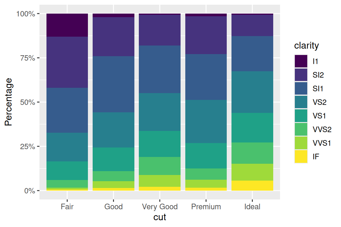
breaks 的另一个用途是,当您有相对较少的数据点并希望准确地突出观察结果时。 例如,以这一绘图为例,显示了每位美国总统何时开始并结束任期。
presidential |>
  mutate(id = 33 + row_number()) |>
  ggplot(aes(x = start, y = id)) +
  geom_point() +
  geom_segment(aes(xend = end, yend = id)) +
  scale_x_date(name = NULL, breaks = presidential$start, date_labels = "'%y")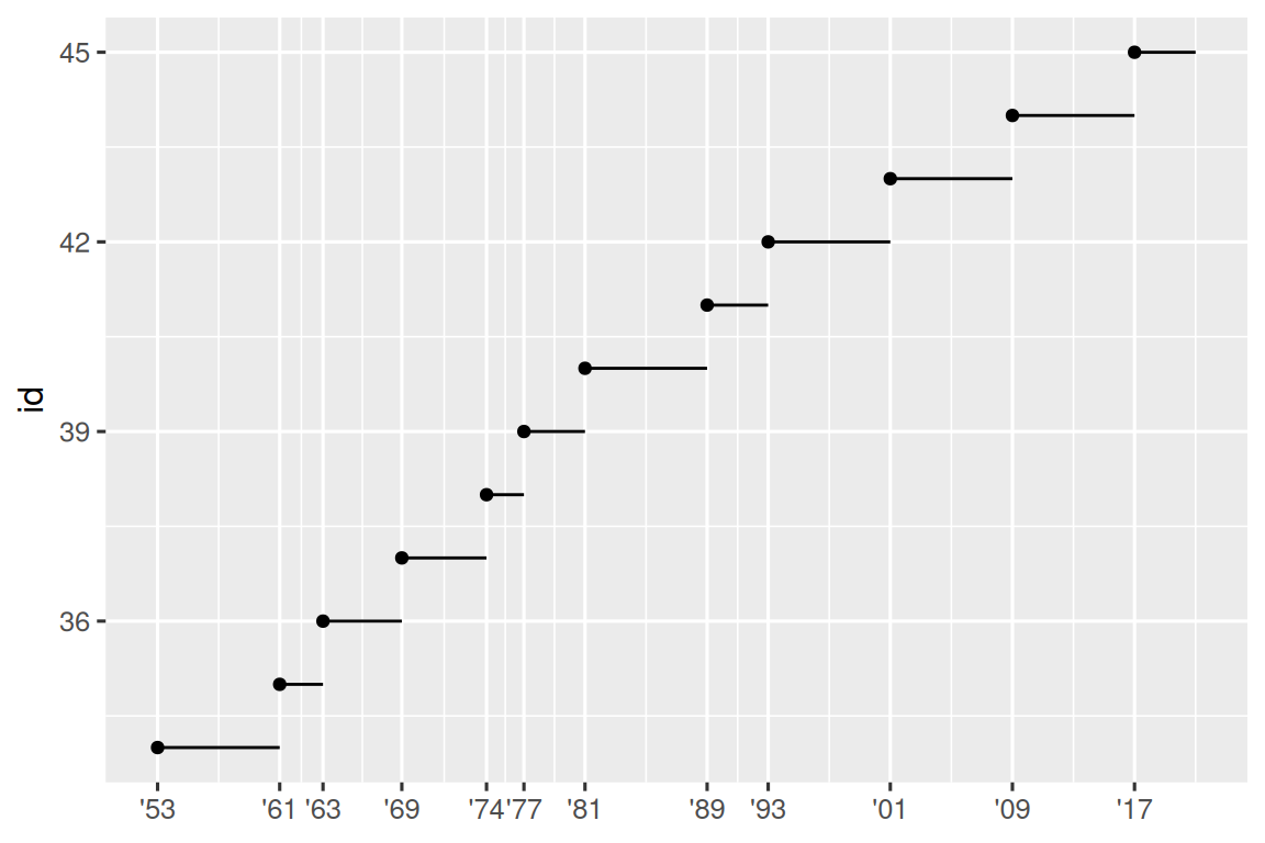
请注意,对于 breaks 参数,我们将 start 变量替换为 presidential$start 向量,是因为我们无法为此参数进行美学映射。 另请注意,date 和 datetime scales 的 breaks 和 labels 的规范有些不同:
date_labels采用与parse_datetime()形式相同的格式规范。date_breaks(此处未显示),使用 “2 days” 或 “1 month” 之类的字符串。
11.4.3 Legend layout
您通常会使用 breaks 和 labels 来调整轴。 尽管它们也都为图例工作,但您更有可能使用其他一些技术。
为了控制图例的整体位置,您需要使用 theme() 设置。 我们将在本章末尾回到 themes,但简而言之,它们控制着绘图的非数据部分。 theme 设置 legend.position 控制绘制图例的位置:
base <- ggplot(mpg, aes(x = displ, y = hwy)) +
  geom_point(aes(color = class))

base + theme(legend.position = "right") # the default
base + theme(legend.position = "left")
base +
  theme(legend.position = "top") +
  guides(color = guide_legend(nrow = 3))
base +
  theme(legend.position = "bottom") +
  guides(color = guide_legend(nrow = 3))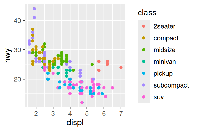
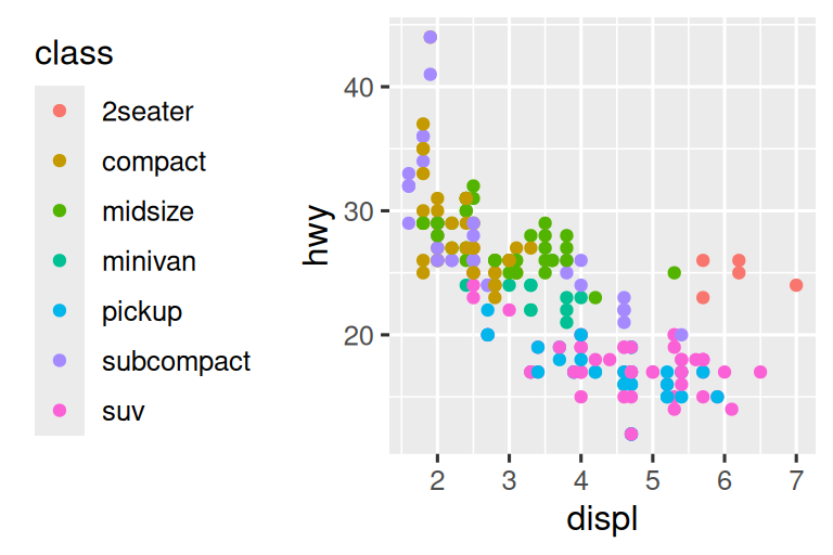
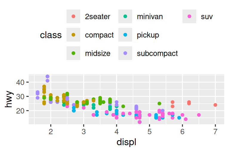
如果您的绘图短而宽,则将图例放在顶部或底部,如果它高而窄,则将图例放在左或右侧。 您也可以使用 legend.position = "none" 来抑制图例的显示。
要控制单个图例的显示,请与 guides() 一起使用 guide_legend() 或 guide_colorbar()。 下面的示例显示了两个重要的设置:使用 nrow 控制图例的行数,使用 override.aes 覆盖一种美学以使点更大。 如果您使用低 alpha 在图上显示许多点,这将特别有用。
ggplot(mpg, aes(x = displ, y = hwy)) +
  geom_point(aes(color = class)) +
  geom_smooth(se = FALSE) +
  theme(legend.position = "bottom") +
  guides(color = guide_legend(nrow = 2, override.aes = list(size = 4)))
#> `geom_smooth()` using method = 'loess' and formula = 'y ~ x'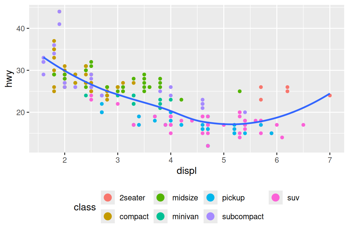
11.4.4 Replacing a scale
您不仅可以对细节进行一些调整,还可以完全替换 scale。 您大多有可能要切换两种类型的 scales:连续位置 scales 和颜色 scales。 幸运的是,相同的原则适用于所有其他美学,因此,一旦掌握了位置和颜色,您就可以快速拿起其他 scale 替代品。
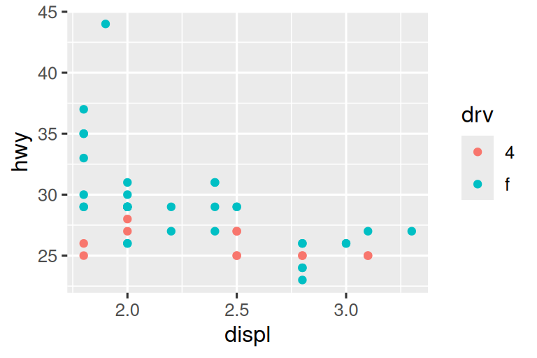
绘制变量的转换非常有用。 例如,如果我们 log 转换它们,则更容易看到 carat 和 price 之间的确切关系:
# Left
ggplot(diamonds, aes(x = carat, y = price)) +
  geom_bin2d()
#> `stat_bin2d()` using `bins = 30`. Pick better value `binwidth`.

# Right
ggplot(diamonds, aes(x = log10(carat), y = log10(price))) +
  geom_bin2d()
#> `stat_bin2d()` using `bins = 30`. Pick better value `binwidth`.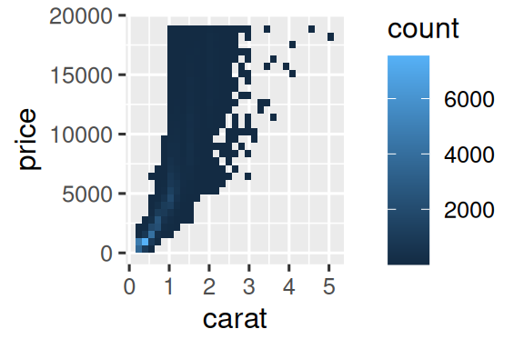
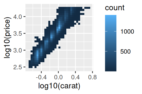
但是,这种转换的缺点是轴现在用转换值标记,因此很难解释图。 与其在美学映射中进行转换,我们可以用 scale 来进行。 这在视觉上是相同的,除了轴以原始数据 scale 标记。
ggplot(diamonds, aes(x = carat, y = price)) +
  geom_bin2d() +
  scale_x_log10() +
  scale_y_log10()
#> `stat_bin2d()` using `bins = 30`. Pick better value `binwidth`.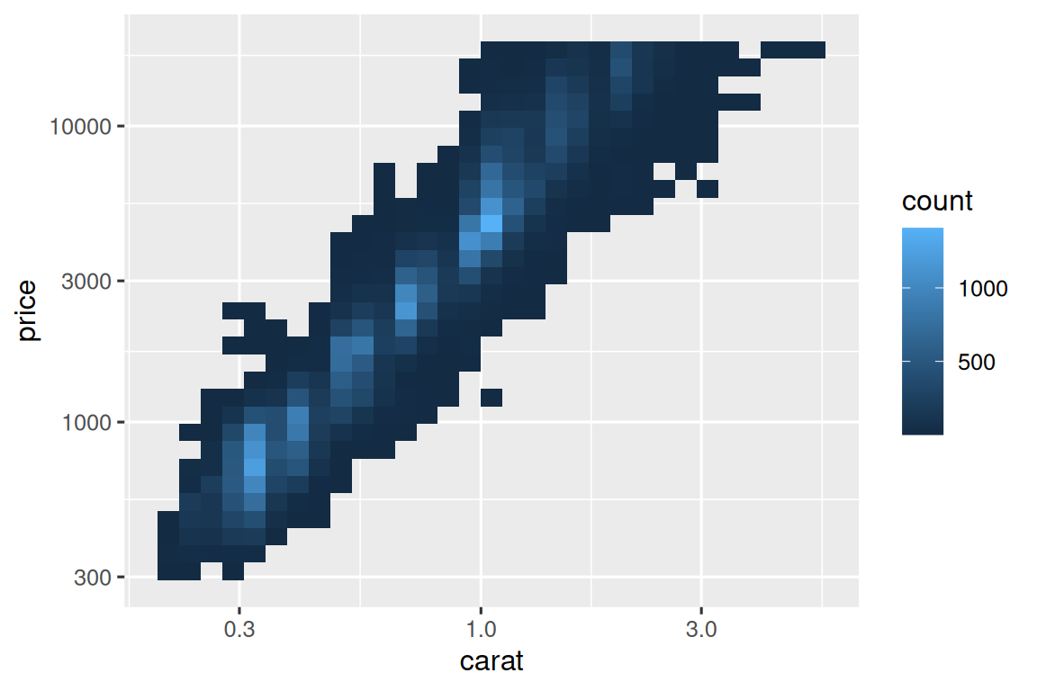
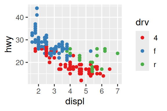
经常自定义的另一个 scale 是 color。 默认的分类 scale 挑选围绕色轮均匀间隔的颜色。 有用的替代方法是手工调整的 ColorBrewer scales,可以为具有常见的色盲类型的人提供更好的工作。 下面的两个图看起来相似,但是红色和绿色的阴影有足够的差异,即使有红绿色盲的人也可以区分右边的点。1
ggplot(mpg, aes(x = displ, y = hwy)) +
  geom_point(aes(color = drv))

ggplot(mpg, aes(x = displ, y = hwy)) +
  geom_point(aes(color = drv)) +
  scale_color_brewer(palette = "Set1")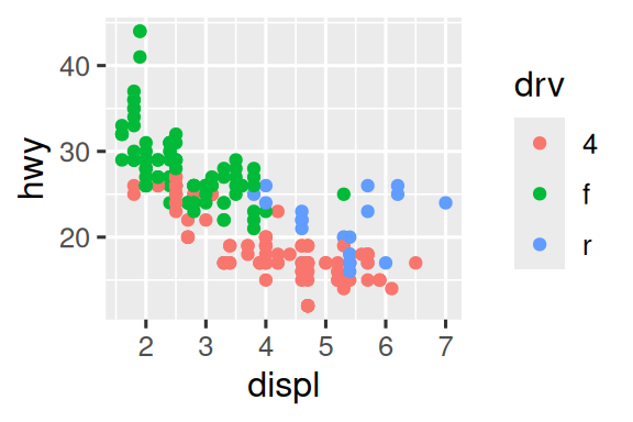
不要忘记改善可访问性的简单技术。 如果只有几种颜色,则可以添加冗余形状映射。 这也将有助于确保您的绘图在黑白中可以解释。
ggplot(mpg, aes(x = displ, y = hwy)) +
  geom_point(aes(color = drv, shape = drv)) +
  scale_color_brewer(palette = "Set1")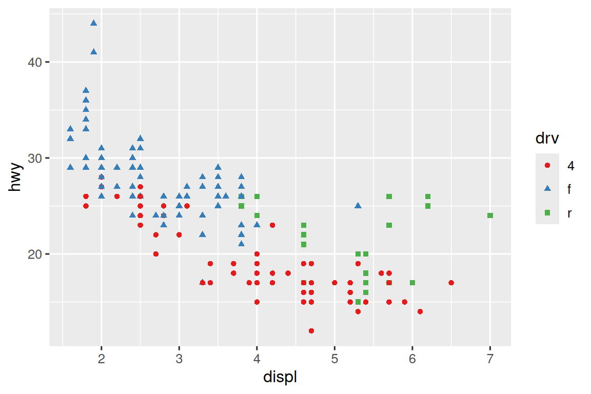
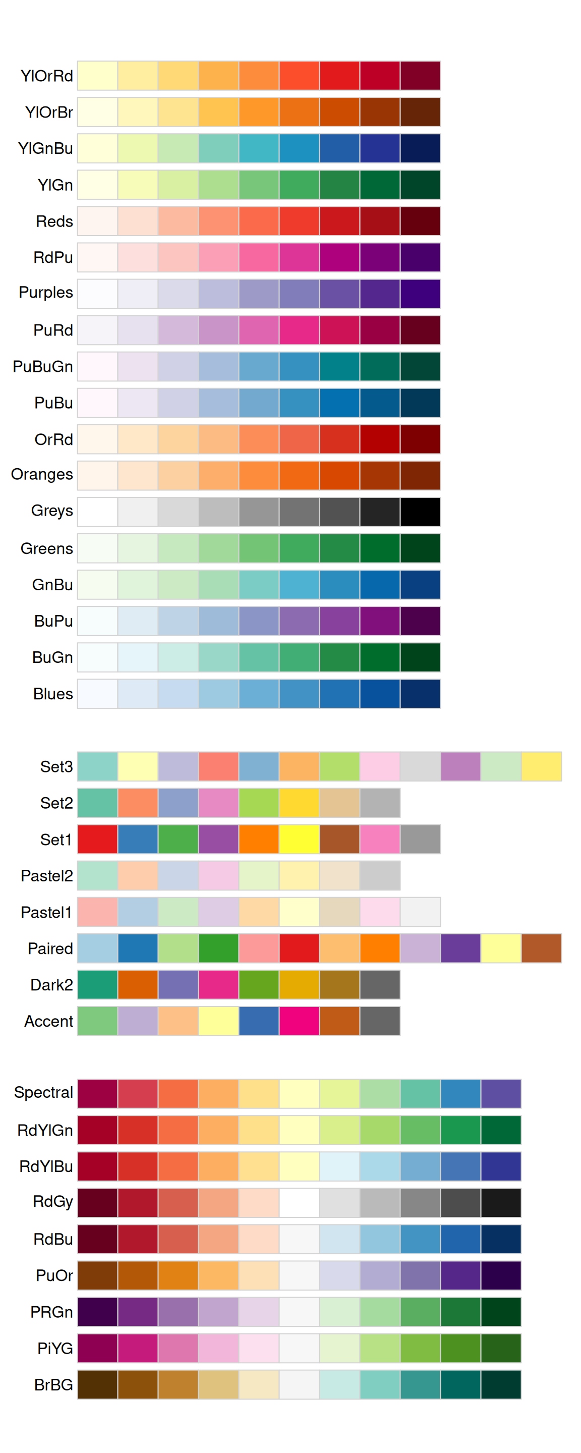
ColorBrewer scales 在 https://colorbrewer2.org/ 上在线记录,并通过 Erich Neuwirth 的 RColorBrewer 软件包在 R 中提供。 Figure 11.1 显示了所有调色板的完整列表。 连续(顶部)和离散(底部)调色板特别有用,如果您的分类值被排序或具有“中间”值。 这通常会出现在如果您使用 cut() 将连续变量变成一个分类变量。
当您在值和颜色之间具有预定义的映射时,请使用 scale_color_manual()。 例如,如果我们将 presidential party 映射给 color,我们希望将红色的标准映射用于 Republicans 和蓝色用于 Democrats。 分配这些颜色的一种方法是使用 hex 颜色代码:
presidential |>
  mutate(id = 33 + row_number()) |>
  ggplot(aes(x = start, y = id, color = party)) +
  geom_point() +
  geom_segment(aes(xend = end, yend = id)) +
  scale_color_manual(values = c(Republican = "#E81B23", Democratic = "#00AEF3"))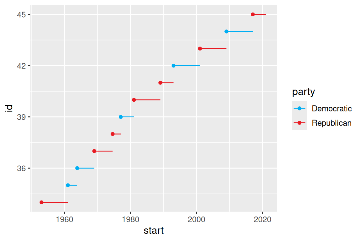
对于连续颜色,您可以使用内置 scale_color_gradient() 或 scale_fill_gradient()。 如果您有一个 diverging scale,则可以使用 scale_color_gradient2()。 这使您可以给出例如正值和负值不同的颜色。 如果您想区分均值以上或以下的点时,这也很有用。
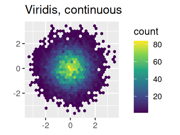
另一个选择是使用 viridis color scales。 设计师 Nathaniel Smith 和 Stéfan van der Walt 精心量身定制的连续配色方案,这些配色方案对各种形式的色盲以及颜色和黑色和白色的感知均匀的人都可以感知。 这些 scales 可作为连续(continuous,c),离散(discrete,d)和 ggplot2 中的 binned(b)调色板提供。
df <- tibble(
  x = rnorm(10000),
  y = rnorm(10000)
)

ggplot(df, aes(x, y)) +
  geom_hex() +
  coord_fixed() +
  labs(title = "Default, continuous", x = NULL, y = NULL)

ggplot(df, aes(x, y)) +
  geom_hex() +
  coord_fixed() +
  scale_fill_viridis_c() +
  labs(title = "Viridis, continuous", x = NULL, y = NULL)

ggplot(df, aes(x, y)) +
  geom_hex() +
  coord_fixed() +
  scale_fill_viridis_b() +
  labs(title = "Viridis, binned", x = NULL, y = NULL)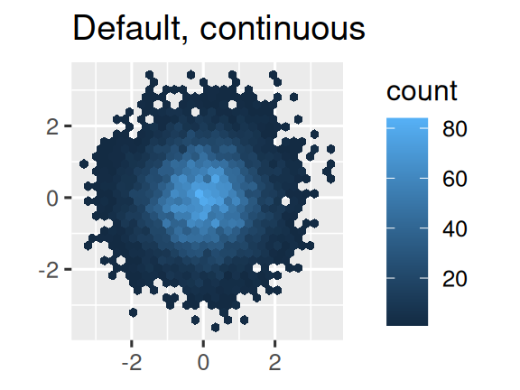
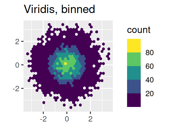
请注意,所有颜色 scales 都有两个类型:scale_color_*() 和 scale_fill_*() 分别用于 color 和 fill 美学(英式和英式拼写都可以使用 color scales)。
11.4.5 Zooming
有三种控制图限制(limits)的方法:
- 调整绘制哪些数据。
- 在每个 scale 中设置 limits。
- 在
coord_cartesian()中设置xlim和ylim。
我们将在一系列绘图中演示这些选项。 左侧的绘图显示了发动机尺寸和燃油效率之间的关系,并通过驱动器类型进行着色。 右侧的图显示了相同的变量,但是用子集绘制的数据。 子集数据影响了 x 和 y scales 以及平滑曲线。
# Left
ggplot(mpg, aes(x = displ, y = hwy)) +
  geom_point(aes(color = drv)) +
  geom_smooth()

# Right
mpg |>
  filter(displ >= 5 & displ <= 6 & hwy >= 10 & hwy <= 25) |>
  ggplot(aes(x = displ, y = hwy)) +
  geom_point(aes(color = drv)) +
  geom_smooth()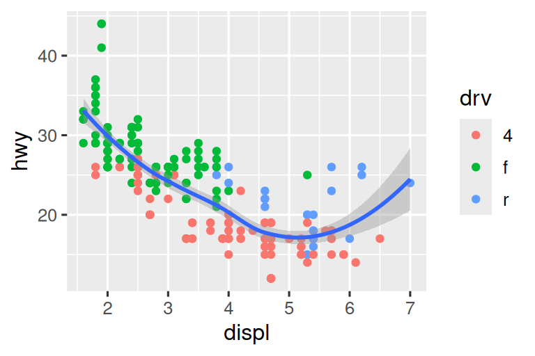
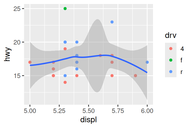
让我们将它们与下面的两个图进行比较,其中左侧的绘图设置了单个 scales 上的 limits,右侧的绘图在 coord_cartesian() 中设置它们。 我们可以看到,降低 limits 等效于子集。 因此,要放大图块的区域,通常最好使用 coord_cartesian()。
# Left
ggplot(mpg, aes(x = displ, y = hwy)) +
  geom_point(aes(color = drv)) +
  geom_smooth() +
  scale_x_continuous(limits = c(5, 6)) +
  scale_y_continuous(limits = c(10, 25))

# Right
ggplot(mpg, aes(x = displ, y = hwy)) +
  geom_point(aes(color = drv)) +
  geom_smooth() +
  coord_cartesian(xlim = c(5, 6), ylim = c(10, 25))
另一方面,如果要扩大 limits,例如,以匹配不同图的尺度,则通常在单个 scales 上设置 limits 通常更有用。 例如,如果我们提取两类汽车并分别绘制它们,则很难比较绘图,因为所有三个 scales(x-axis,y-axis,color aesthetic)都有不同的范围。
suv <- mpg |> filter(class == "suv")
compact <- mpg |> filter(class == "compact")

# Left
ggplot(suv, aes(x = displ, y = hwy, color = drv)) +
  geom_point()

# Right
ggplot(compact, aes(x = displ, y = hwy, color = drv)) +
  geom_point()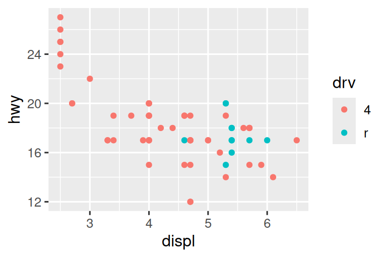
克服此问题的一种方法是在多个图上共享 scales,并使用完整数据的 limits 训练 scales。
x_scale <- scale_x_continuous(limits = range(mpg$displ))
y_scale <- scale_y_continuous(limits = range(mpg$hwy))
col_scale <- scale_color_discrete(limits = unique(mpg$drv))

# Left
ggplot(suv, aes(x = displ, y = hwy, color = drv)) +
  geom_point() +
  x_scale +
  y_scale +
  col_scale

# Right
ggplot(compact, aes(x = displ, y = hwy, color = drv)) +
  geom_point() +
  x_scale +
  y_scale +
  col_scale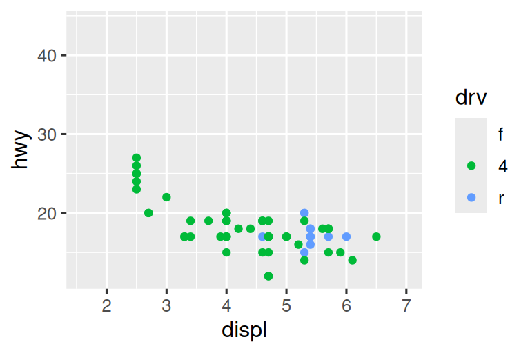
在这种特殊情况下,您可以简单地使用 faceting,但是此技术更普遍地有用,例如,如果您想在报告的多个页面上传播 绘图。
11.4.6 Exercises
-
为什么以下代码不覆盖默认 scale?
df <- tibble(
  x = rnorm(10000),
  y = rnorm(10000)
)

ggplot(df, aes(x, y)) +
  geom_hex() +
  scale_color_gradient(low = "white", high = "red") +
  coord_fixed()
每个 scale 的第一个参数是什么? 与
labs()相比如何?-
通过以下方式更改 presidential terms 的显示
- 结合自定义 colors 和 x 轴 breaks 这两个变量。
- 改善 y 轴的显示。
- 将每个 term 标记为总统的名字。
- 添加内容丰富的绘图标签。
- 替换 breaks 为每 4 年(这比看起来更棘手!)。
-
首先,创建以下图。 然后,使用
override.aes修改代码,以使图例更容易看到。ggplot(diamonds, aes(x = carat, y = price)) + geom_point(aes(color = cut), alpha = 1/20)
11.5 Themes
最后,您可以用主题自定义绘图的非数据元素:
ggplot(mpg, aes(x = displ, y = hwy)) +
  geom_point(aes(color = class)) +
  geom_smooth(se = FALSE) +
  theme_bw()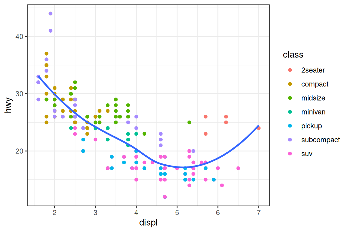
ggplot2 包括 Figure 11.2 中所示的八个主题,theme_gray() 作为默认值。2 诸如 Jeffrey Arnold 的 ggthemes (https://jrnold.github.io/ggthemes) 之类的附加软件包中包含了更多主题。 您也可以创建自己的主题,如果您要匹配特定的公司或期刊样式。
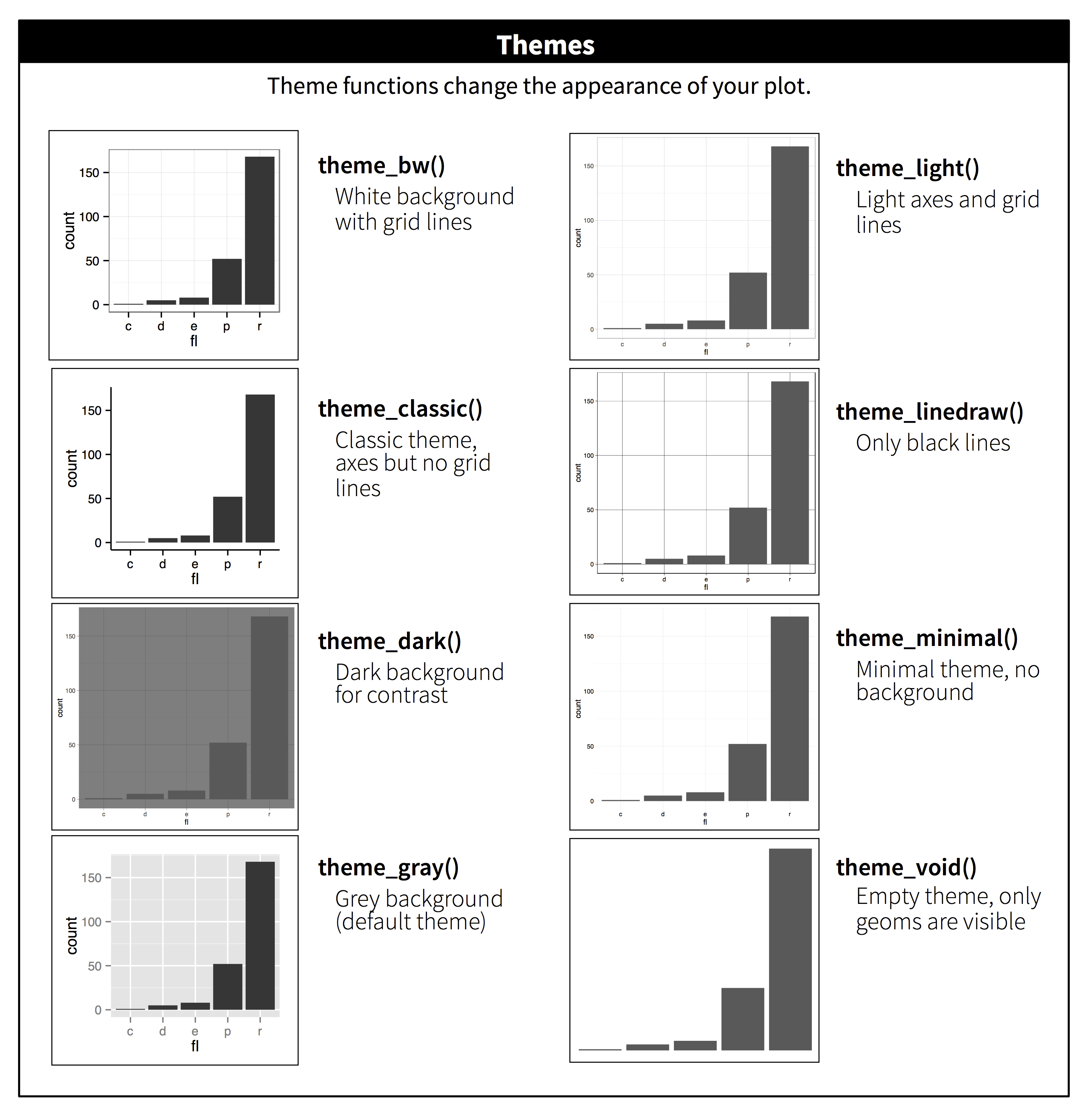
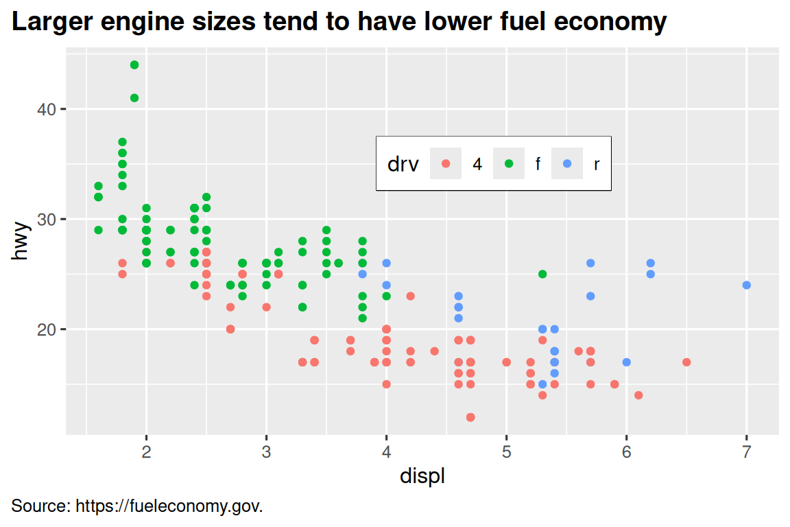
也可以控制每个主题的各个组件,例如用于 y 轴的字体的大小和颜色。 我们已经看到了 legend.position 控制图例的绘制位置。 图例中还有许多其他方面可以通过 theme() 自定义。 例如,在下面的绘图中,我们改变了图例的方向,并在其周围放置了一个黑色边框。 请注意,通过 element_*() 函数,自定义图例框和主题的图标题元素。 这些函数指定了非数据组件的样式,例如,标题文本在 element_text() 的 face 参数中被加粗,而图例边框颜色 element_rect() 的 color 参数中定义。 控制 title 和 caption 位置的主题元素分别为 plot.title.position 和 plot.caption.position。 在以下图中,这些设置为 "plot",以指示这些元素与整个绘图区域对齐,而不是绘图面板(默认值)。 其他一些有用的 theme() 组件用于更改 title 和 caption 文本格式的位置。
ggplot(mpg, aes(x = displ, y = hwy, color = drv)) +
  geom_point() +
  labs(
    title = "Larger engine sizes tend to have lower fuel economy",
    caption = "Source: https://fueleconomy.gov."
  ) +
  theme(
    legend.position = c(0.6, 0.7),
    legend.direction = "horizontal",
    legend.box.background = element_rect(color = "black"),
    plot.title = element_text(face = "bold"),
    plot.title.position = "plot",
    plot.caption.position = "plot",
    plot.caption = element_text(hjust = 0)
  )
有关所有 theme() 组件的概述,请参见 ?theme。 ggplot2 book 也是有关主题的全部详细信息的好地方。
11.5.1 Exercises
- 选择 ggthemes 软件包提供的主题,并将其应用于您制作的最后一个绘图。
- 使绘图的轴标签为蓝色和粗体。
11.6 Layout
到目前为止,我们讨论了如何创建和修改单个图。 如果您想以某种方式布置多个图怎么办? patchwork 软件包允许您将单独的图组合到同一图形中。 我们在本章的早期加载了此软件包。
要彼此放置两个绘图,您只需将它们互相添加。 请注意,您首先需要创建图并将其保存为对象(在下面的示例中,它们称为 p1 和 p2)。 然后,你放置它们彼此相邻通过 +。
p1 <- ggplot(mpg, aes(x = displ, y = hwy)) +
  geom_point() +
  labs(title = "Plot 1")
p2 <- ggplot(mpg, aes(x = drv, y = hwy)) +
  geom_boxplot() +
  labs(title = "Plot 2")
p1 + p2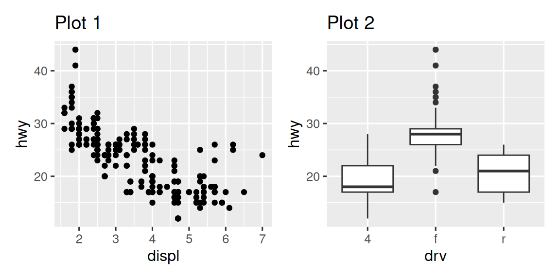
重要的是要注意,在上面的代码块中,我们没有使用 patchwork 软件包中的新函数。 相反,软件包向 + 运算符添加了新功能。
您还可以使用 patchwork 创建复杂的绘图布局。 在下面,| 将 p1 和 p3 彼此相邻,/ 将 p2 移至下一行。
p3 <- ggplot(mpg, aes(x = cty, y = hwy)) +
  geom_point() +
  labs(title = "Plot 3")
(p1 | p3) / p2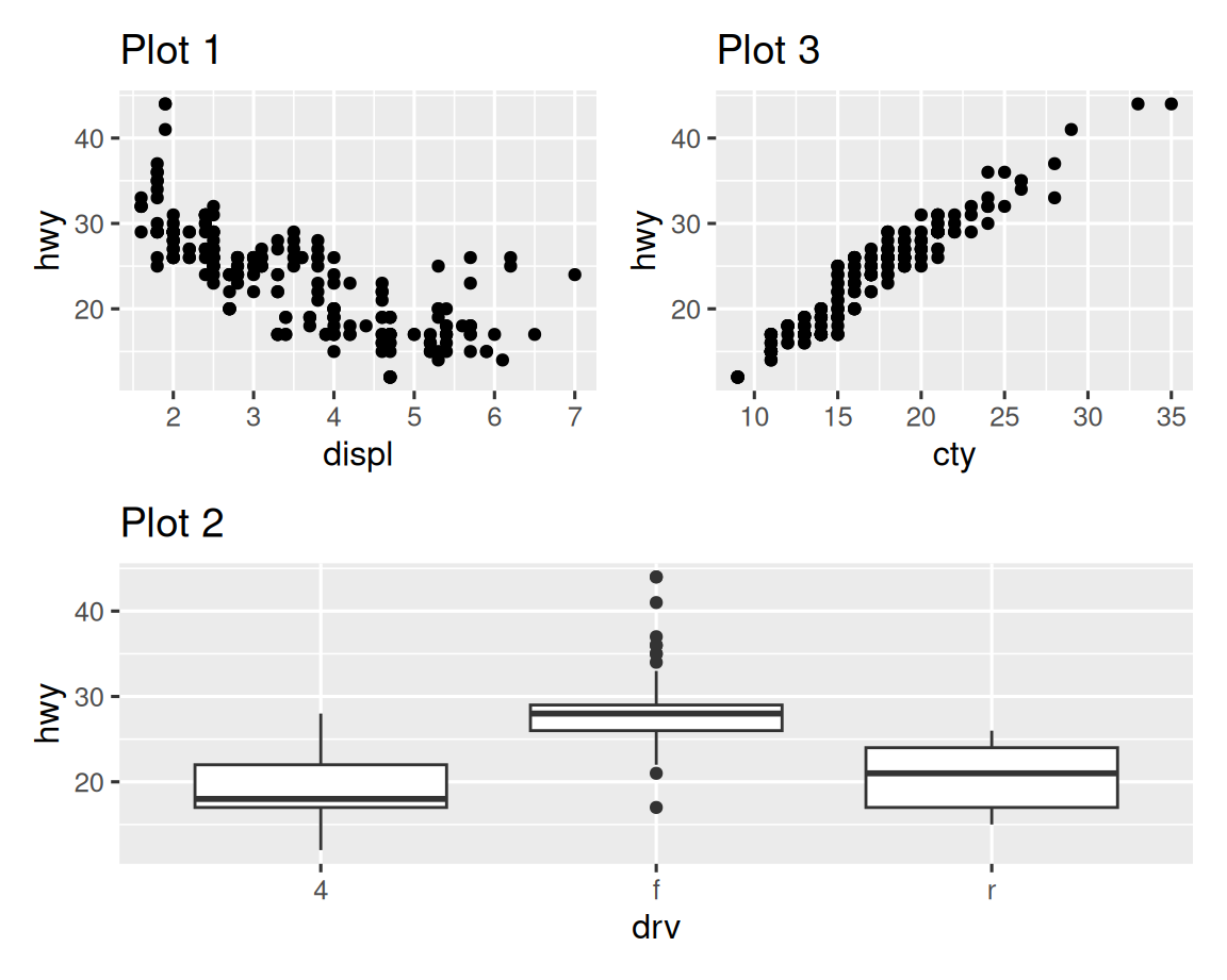
此外,patchwork 允许您从多个绘图中收集图例为一个通用图例,并自定义图例的位置以及图的尺寸,并在图中添加一个通用 title,subtitle,caption 等。 下面我们创建5个图。 我们已经关闭了 box plots 和 scatterplot 上的图例,并通过 & theme(legend.position = "top") 收集了 density plots 的图例绘制在顶部。 请注意,这里的使用 & 运算符而不是通常的 +。 这是因为我们正在修改 patchwork 图的主题,而不是单个 ggplots。 图例放在 guide_area() 内部的顶部。 最后,我们还定制了 patchwork 的各个组件的高度 – guide 的高度为 1,box plots 为 3,density plots 为 2,faceted scatterplot 为 4。 Patchwork 将您分配给绘图的区域,并使用此刻度分配了您的绘图区域,并将组件放置相应地放置。
p1 <- ggplot(mpg, aes(x = drv, y = cty, color = drv)) +
  geom_boxplot(show.legend = FALSE) +
  labs(title = "Plot 1")

p2 <- ggplot(mpg, aes(x = drv, y = hwy, color = drv)) +
  geom_boxplot(show.legend = FALSE) +
  labs(title = "Plot 2")

p3 <- ggplot(mpg, aes(x = cty, color = drv, fill = drv)) +
  geom_density(alpha = 0.5) +
  labs(title = "Plot 3")

p4 <- ggplot(mpg, aes(x = hwy, color = drv, fill = drv)) +
  geom_density(alpha = 0.5) +
  labs(title = "Plot 4")

p5 <- ggplot(mpg, aes(x = cty, y = hwy, color = drv)) +
  geom_point(show.legend = FALSE) +
  facet_wrap(~drv) +
  labs(title = "Plot 5")

(guide_area() / (p1 + p2) / (p3 + p4) / p5) +
  plot_annotation(
    title = "City and highway mileage for cars with different drive trains",
    caption = "Source: https://fueleconomy.gov."
  ) +
  plot_layout(
    guides = "collect",
    heights = c(1, 3, 2, 4)
    ) &
  theme(legend.position = "top")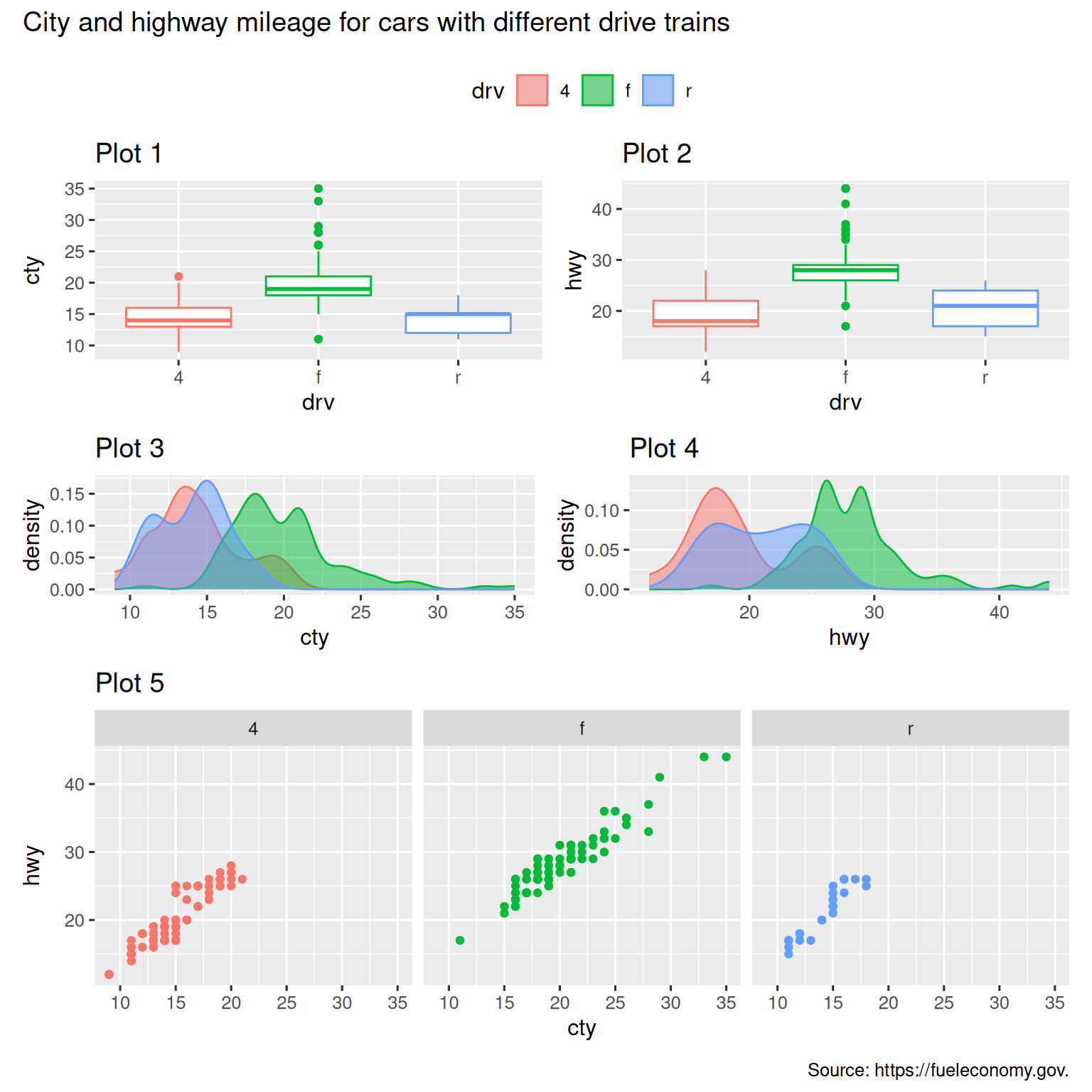
如果您想了解有关将多个图与 patchwork 相结合和布局的更多信息,我们建议您在软件包网站上查看指南:https://patchwork.data-imaginist.com。
11.6.1 Exercises
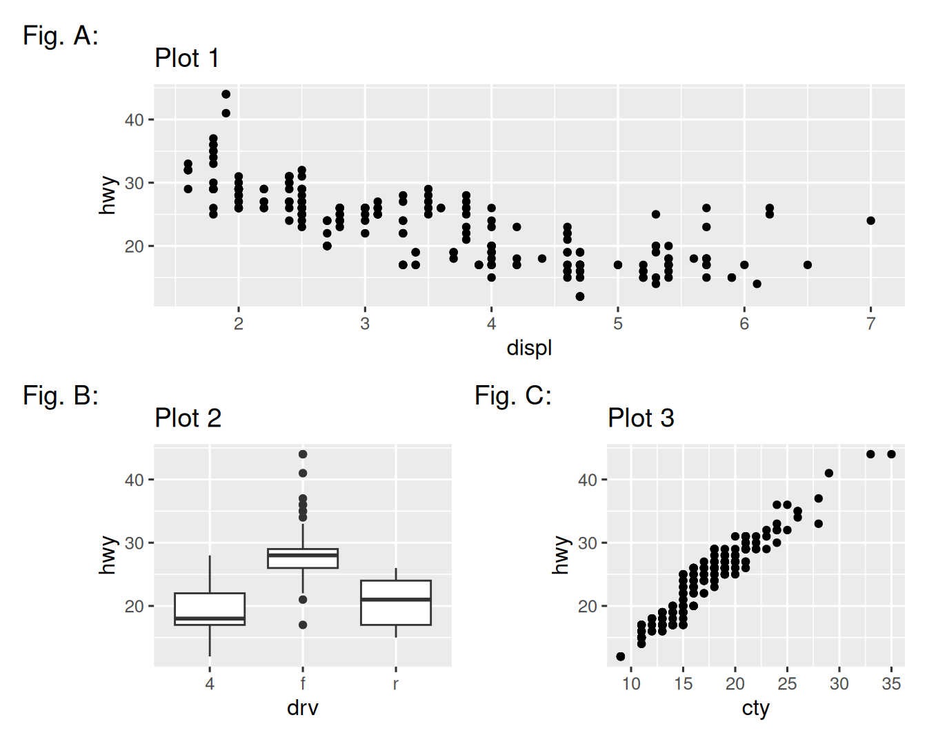
-
如果您在以下绘图布局中省略括号,会发生什么。 您能解释一下为什么会发生这种情况吗?
p1 <- ggplot(mpg, aes(x = displ, y = hwy)) + geom_point() + labs(title = "Plot 1") p2 <- ggplot(mpg, aes(x = drv, y = hwy)) + geom_boxplot() + labs(title = "Plot 2") p3 <- ggplot(mpg, aes(x = cty, y = hwy)) + geom_point() + labs(title = "Plot 3") (p1 | p2) / p3 -
使用上一个练习中的三个图,重新创建以下拼布。
11.7 Summary
在本章中,您已经了解了添加图标签,例如 title,subtitle,caption 以及修改默认轴标签,使用注释将信息文本添加到图中或突出显示特定的数据点,自定义轴 scales 以及更改图的主题。 您还了解了使用简单和复杂的绘图布局在单个图中组合多个图。
到目前为止,您已经了解了如何制作多种不同类型的图以及如何使用各种技术自定义它们,但我们对 ggplot2 的介绍仅停留在表面。 如果您想对 ggplot2 有全面的了解,我们建议阅读 ggplot2: Elegant Graphics for Data Analysis。 其他有用的资源是 Winston Chang 的 R Graphics Cookbook 和 Claus Wilke 的 Fundamentals of Data Visualization。
您可以使用 SimDaltonism 之类的工具模拟色盲来测试这些图像。↩︎
许多人想知道为什么默认主题具有灰色背景。 这是一个故意的选择,因为它可以将数据传递到同时使网格线可见。 白色网格线是可见的(这很重要,因为它们可以大大帮助位置判断),但是它们的视觉影响很小,我们可以轻松地将它们调出。 灰色背景使绘图与文本具有类似的印刷色彩,从而确保图形与文档的流程符合文档的流程,而不会以明亮的白色背景跳出。 最后,灰色背景创建了一个连续的颜色字段,可确保图被视为单个视觉实体。↩︎